Make a movement, not a logo
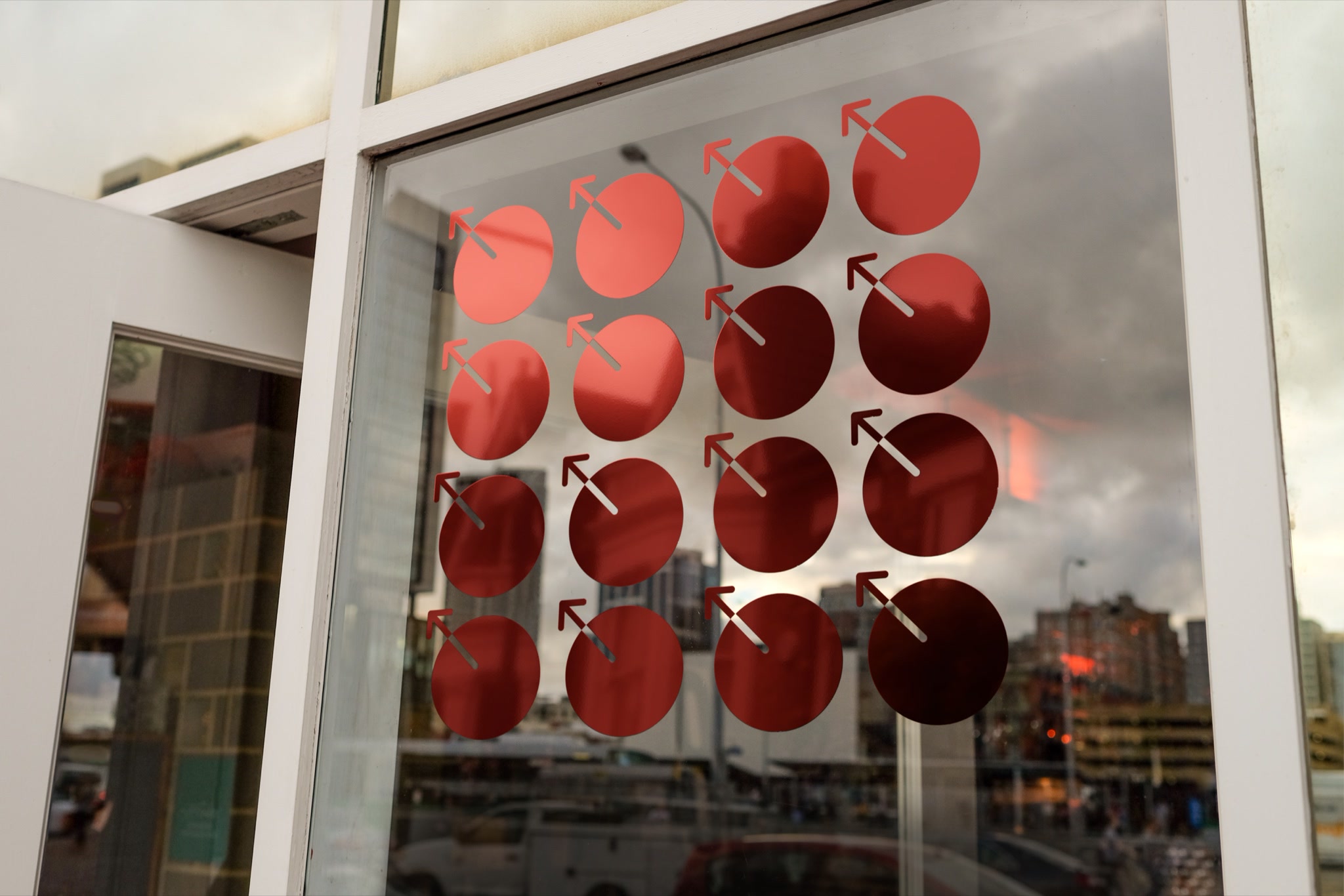
An arrow escaping a circle creates a compact gesture of redirection and collective movement.
BRAND · LAUNCH · 2023
An identity in motion, with an original synth score
Problem
MetaDAO needed an unfamiliar governance model to feel approachable and a mark the community could recognize and reuse.
Approach
Build around an arrow breaking out of a circle. Rotation, repetition, red / blue imagery, and an original synth score give one simple mark range and energy.
Authorship & cultural reach
The identity carried into product, social, and community use. Release films paired the mark with an original soundtrack I composed and produced.
Key decisions
An arrow escaping a circle creates a compact gesture of redirection and collective movement.
I composed the synth score around the edits, rotation, and repetition so sound and image share one rhythm.
Clockwise rotation suggests time running out, giving the mark a recognizable motion behavior.
The brand book tests the mark across interfaces, print, packaging, posters, and environmental scale.
One system, authored end to end
The project moved from one irreducible mark to a complete audiovisual launch system without splitting identity, motion, and sound into separate disciplines.
01
I directed the launch films and composed their synth soundtrack, timing rotation and repetition to the music.
02
The complete brand book covers symbol, motion, typography, color, and physical and digital applications.
03
Anaglyph depth, institutional architecture, and surreal imagery give governance a distinctive visual setting.
04
05
06
07
The mark holds its identity as an avatar, repeated pattern, or architectural graphic.
08
09