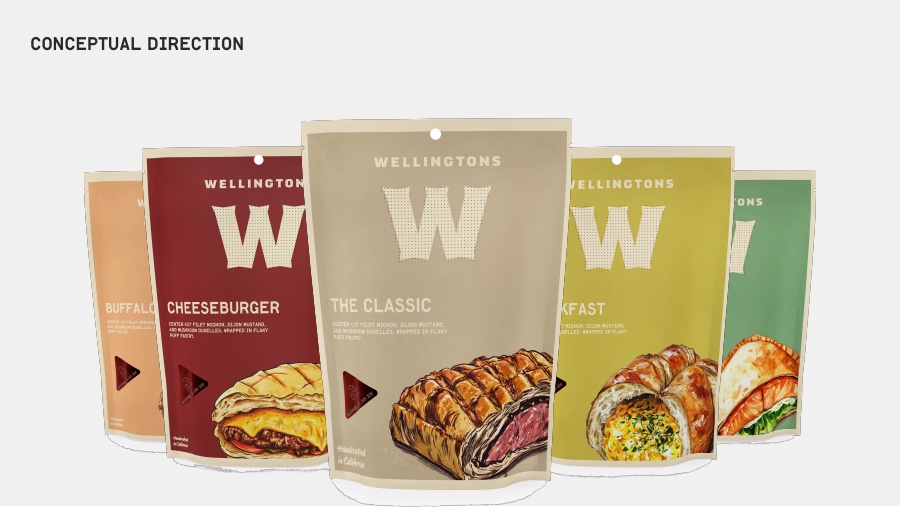
Wellingtons conceptual packaging direction with oversized W monograms and food illustrations

BRAND · 2026

Wellingtons

A premium e-commerce food brand built for discovery, gifting, and repeat purchase

Timeline
2026
Role
Design trial - brand & packaging
menu colorways
5
e-commerce journey
1
Process & contextStrategy, decisions, outcomes, chronology, and sources

Context

Wellingtons already had memorable ingredients: a large W, warm paper, and a clear relationship between product flavor and pack color. The opportunity was to turn those ingredients into a recognizable e-commerce brand across product discovery, ordering, unboxing, gifting, and repeat purchase.

Product decision

Make the package do the work of an e-commerce storefront. The W becomes a recognizable seal, “locally prepared / generous / handmade” becomes the compact proof line, and the palette separates product families without making the system feel like a supermarket shelf.

Concept outcome

A concept system spanning the pouch family, shipping carton, delivery sleeve, menu card, seals, and reheating card. The work stays intentionally exploratory, but the identity is structured enough to extend into DTC fulfillment, gifting, seasonal drops, and a richer online product experience.

5
menu colorways

The palette separates product families while keeping one recognisable Wellingtons world.

1
e-commerce journey

Product discovery, gifting, unboxing, and reheating are treated as one connected brand experience.

2026
design trial

A complete packaging and brand direction for Wellingtons.

ScopeBrand Identity, Packaging System, E-commerce Touchpoints, Art Direction

Key decisions

Turn the W into an e-commerce mark

The oversized monogram does more than identify the pouch. Used as a seal, liner repeat, and shipping cue, it makes the product family recognizable from product page to doorstep.

Use color to separate product families

Oxblood, bone, mustard, celery, and peach give each product family a distinct appetite without fragmenting the parent brand.

Make handmade feel systematised

Screen-printed texture, drawn food sections, uncoated paper, and a compact proof line create a craft signal that still scales across SKUs and e-commerce fulfillment formats.

Design the handoff after purchase

The shipping carton, delivery sleeve, and reheating card extend the identity into the practical details that make an e-commerce order feel considered.

A five-color pouch family built around one oversized W and a recognizable e-commerce shelf.

01

Packaging becomes the e-commerce experience

The direction continues beyond the pouch: a shipping carton, menu card, seals, delivery sleeve, and reheating card make the identity feel present from product page to doorstep.

Carton, menu, seals, sleeve, and reheating card - the brand in the hands of the customer.

02

Start with the strongest signals

The direction had the right instinct: make quality visible, use color to separate product families, and let the food do the talking. The system keeps those cues while giving them a clearer life across packaging and e-commerce.

A clear family of pouches with a memorable W.
Quality and flavor carried by material and color.

03

Give every flavor its own world

The design deck expands the pouch family into a set of distinct menu moments. The same W, paper stock, and appetite-led illustration hold the system together while each flavor gets its own color and voice.

Breakfast: warm, generous, and immediate.
Cheeseburger: a familiar cue pushed into the Wellingtons world.
Nutellington: the indulgent edge of the menu.

04

The full design deck

The original Wellingtons design presentations are embedded here for a closer look at the packaging system, flavor explorations, and visual language.

Wellingtons design presentation - full-resolution deck. Open PDF ↗
Alternate Wellingtons design export. Open PDF ↗

05

Let texture carry the craft

Uncoated stock, plate-like imperfections, and drawn food sections keep the system close to the product. The result is a premium e-commerce identity with a human hand still visible in the surface.

Material, illustration, and appetite in one close-up.

2026 CONNOR LEE

LOS ANGELES, CA